Zes juffen en meesters met pensioen
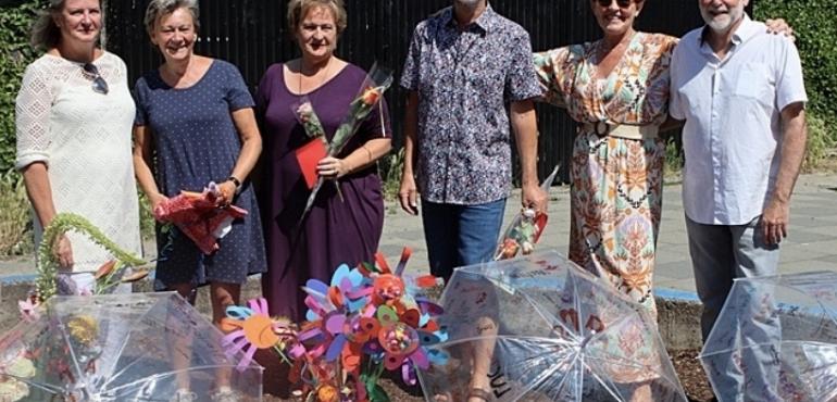
Op 26 juni namen we met een groot feest afscheid van zes juffen en meesters van de Regenboog. Vincent, Jenny, Leonard, Emmy, Thea en Toos, we zullen jullie missen!!!
Op 26 juni namen we met een groot feest afscheid van zes juffen en meesters van de Regenboog. Vincent, Jenny, Leonard, Emmy, Thea en Toos, we zullen jullie missen!!!