.transition is undefined in /hosting/deregenboogschool.nl/public_html/templates/main/obo/css/assets.less
variable @screen-sm-min is undefined in file /hosting/deregenboogschool.nl/public_html/templates/main/obo/css/styleguide_variables.less in styleguide_variables.less on line 24, column 9 22| @button-secondary-color: #e20714 ; 23| @button-tertiary-color: #000000 ; 24| @phone: "only screen and (max-width: @{screen-sm-min})" ; 25| @phone-strict: "only screen and (min-width: @{screen-xs-min}) and (max-width: @{screen-xs-max})" ; 26| @tablet: "only screen and (max-width: @{screen-md-min})" ; 27| @tablet-strict: "only screen and (min-width: @{screen-sm-min}) and (max-width: @{screen-sm-max})" ;
.transition is undefined in /hosting/deregenboogschool.nl/public_html/templates/main/obo/css/elements/buttons.less
variable @screen-sm-min is undefined in file /hosting/deregenboogschool.nl/public_html/templates/main/obo/css/styleguide_variables.less in styleguide_variables.less on line 24, column 9 22| @button-secondary-color: #e20714 ; 23| @button-tertiary-color: #000000 ; 24| @phone: "only screen and (max-width: @{screen-sm-min})" ; 25| @phone-strict: "only screen and (min-width: @{screen-xs-min}) and (max-width: @{screen-xs-max})" ; 26| @tablet: "only screen and (max-width: @{screen-md-min})" ; 27| @tablet-strict: "only screen and (min-width: @{screen-sm-min}) and (max-width: @{screen-sm-max})" ;
variable @screen-sm-max is undefined in file /hosting/deregenboogschool.nl/public_html/templates/menu/horizontaal (simplified)/src/menu.less in menu.less on line 5, column 22 3| ========================================================================== */ 4| .menu-horizontal { 5| @media (max-width: @screen-sm-max) { 6| display: none; 7| &.is-active { 8| display: block;
variable @screen-sm-min is undefined in file /hosting/deregenboogschool.nl/public_html/templates/main/obo/css/styleguide_variables.less in styleguide_variables.less on line 24, column 9 22| @button-secondary-color: #e20714 ; 23| @button-tertiary-color: #000000 ; 24| @phone: "only screen and (max-width: @{screen-sm-min})" ; 25| @phone-strict: "only screen and (min-width: @{screen-xs-min}) and (max-width: @{screen-xs-max})" ; 26| @tablet: "only screen and (max-width: @{screen-md-min})" ; 27| @tablet-strict: "only screen and (min-width: @{screen-sm-min}) and (max-width: @{screen-sm-max})" ;
variable @screen-sm-max is undefined in file /hosting/deregenboogschool.nl/public_html/templates/overlay/bianca/src/overlay.less in overlay.less on line 10, column 20 08| } 09| 10| @media (max-width: @screen-sm-max) { 11| .overlay-block { 12| position: fixed; 13| top: 0;
variable @screen-sm-max is undefined in file /hosting/deregenboogschool.nl/public_html/templates/art_blog/obo/css/obo_blog.less in obo_blog.less on line 34, column 22 32| } 33| .news { 34| @media (max-width: @screen-sm-max) { 35| // margin: 20px 0 0; 36| } 37| .collapsed{
variable @screen-sm-min is undefined in file /hosting/deregenboogschool.nl/public_html/templates/main/obo/css/styleguide_variables.less in styleguide_variables.less on line 24, column 9 22| @button-secondary-color: #e20714 ; 23| @button-tertiary-color: #000000 ; 24| @phone: "only screen and (max-width: @{screen-sm-min})" ; 25| @phone-strict: "only screen and (min-width: @{screen-xs-min}) and (max-width: @{screen-xs-max})" ; 26| @tablet: "only screen and (max-width: @{screen-md-min})" ; 27| @tablet-strict: "only screen and (min-width: @{screen-sm-min}) and (max-width: @{screen-sm-max})" ;
variable @screen-md-min is undefined in file /hosting/deregenboogschool.nl/public_html/templates/main/obo/css/styleguide.less in styleguide.less on line 33, column 20 31| margin-bottom: 0; 32| } 33| @media (min-width: @screen-md-min) { 34| h1, .h1-like { 35| font-size: 30px; 36| line-height: 36px;
variable @screen-sm-min is undefined in file /hosting/deregenboogschool.nl/public_html/templates/main/obo/css/styleguide_variables.less in styleguide_variables.less on line 24, column 9 22| @button-secondary-color: #e20714 ; 23| @button-tertiary-color: #000000 ; 24| @phone: "only screen and (max-width: @{screen-sm-min})" ; 25| @phone-strict: "only screen and (min-width: @{screen-xs-min}) and (max-width: @{screen-xs-max})" ; 26| @tablet: "only screen and (max-width: @{screen-md-min})" ; 27| @tablet-strict: "only screen and (min-width: @{screen-sm-min}) and (max-width: @{screen-sm-max})" ;
Nieuws | De Regenboog

Markt en sponsorloop voor de aardbevingsslachtoffers

Markt en sponsorloop voor de aardbevingsslachtoffers

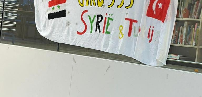
De kinderen van de Gouden Lama's namen helemaal zelf het initiatief om een markt en sponsorloop voor de aardbevingsslachtoffers in Turkije en Syrië te organiseren. Heel vlot hadden ze alles voor elkaar en er werd ruim € 4000,- ingezameld! Wat zijn we trots op onze kinderen!

https://www.blikopnoordwijkerhout.nl/item/29477-kinderen-van-de-regenboogschool-in-actie-voor-giro-555-help-slachtoffers-aardbeving

Archief