.transition is undefined in /hosting/deregenboogschool.nl/public_html/templates/main/obo/css/assets.less
variable @screen-sm-min is undefined in file /hosting/deregenboogschool.nl/public_html/templates/main/obo/css/styleguide_variables.less in styleguide_variables.less on line 24, column 9 22| @button-secondary-color: #e20714 ; 23| @button-tertiary-color: #000000 ; 24| @phone: "only screen and (max-width: @{screen-sm-min})" ; 25| @phone-strict: "only screen and (min-width: @{screen-xs-min}) and (max-width: @{screen-xs-max})" ; 26| @tablet: "only screen and (max-width: @{screen-md-min})" ; 27| @tablet-strict: "only screen and (min-width: @{screen-sm-min}) and (max-width: @{screen-sm-max})" ;
.transition is undefined in /hosting/deregenboogschool.nl/public_html/templates/main/obo/css/elements/buttons.less
variable @screen-sm-min is undefined in file /hosting/deregenboogschool.nl/public_html/templates/main/obo/css/styleguide_variables.less in styleguide_variables.less on line 24, column 9 22| @button-secondary-color: #e20714 ; 23| @button-tertiary-color: #000000 ; 24| @phone: "only screen and (max-width: @{screen-sm-min})" ; 25| @phone-strict: "only screen and (min-width: @{screen-xs-min}) and (max-width: @{screen-xs-max})" ; 26| @tablet: "only screen and (max-width: @{screen-md-min})" ; 27| @tablet-strict: "only screen and (min-width: @{screen-sm-min}) and (max-width: @{screen-sm-max})" ;
variable @screen-sm-max is undefined in file /hosting/deregenboogschool.nl/public_html/templates/menu/horizontaal (simplified)/src/menu.less in menu.less on line 5, column 22 3| ========================================================================== */ 4| .menu-horizontal { 5| @media (max-width: @screen-sm-max) { 6| display: none; 7| &.is-active { 8| display: block;
variable @screen-sm-min is undefined in file /hosting/deregenboogschool.nl/public_html/templates/main/obo/css/styleguide_variables.less in styleguide_variables.less on line 24, column 9 22| @button-secondary-color: #e20714 ; 23| @button-tertiary-color: #000000 ; 24| @phone: "only screen and (max-width: @{screen-sm-min})" ; 25| @phone-strict: "only screen and (min-width: @{screen-xs-min}) and (max-width: @{screen-xs-max})" ; 26| @tablet: "only screen and (max-width: @{screen-md-min})" ; 27| @tablet-strict: "only screen and (min-width: @{screen-sm-min}) and (max-width: @{screen-sm-max})" ;
variable @screen-sm-max is undefined in file /hosting/deregenboogschool.nl/public_html/templates/overlay/bianca/src/overlay.less in overlay.less on line 10, column 20 08| } 09| 10| @media (max-width: @screen-sm-max) { 11| .overlay-block { 12| position: fixed; 13| top: 0;
variable @screen-sm-max is undefined in file /hosting/deregenboogschool.nl/public_html/templates/art_blog/obo/css/obo_blog.less in obo_blog.less on line 34, column 22 32| } 33| .news { 34| @media (max-width: @screen-sm-max) { 35| // margin: 20px 0 0; 36| } 37| .collapsed{
variable @screen-sm-min is undefined in file /hosting/deregenboogschool.nl/public_html/templates/main/obo/css/styleguide_variables.less in styleguide_variables.less on line 24, column 9 22| @button-secondary-color: #e20714 ; 23| @button-tertiary-color: #000000 ; 24| @phone: "only screen and (max-width: @{screen-sm-min})" ; 25| @phone-strict: "only screen and (min-width: @{screen-xs-min}) and (max-width: @{screen-xs-max})" ; 26| @tablet: "only screen and (max-width: @{screen-md-min})" ; 27| @tablet-strict: "only screen and (min-width: @{screen-sm-min}) and (max-width: @{screen-sm-max})" ;
variable @screen-md-min is undefined in file /hosting/deregenboogschool.nl/public_html/templates/main/obo/css/styleguide.less in styleguide.less on line 33, column 20 31| margin-bottom: 0; 32| } 33| @media (min-width: @screen-md-min) { 34| h1, .h1-like { 35| font-size: 30px; 36| line-height: 36px;
variable @screen-sm-min is undefined in file /hosting/deregenboogschool.nl/public_html/templates/main/obo/css/styleguide_variables.less in styleguide_variables.less on line 24, column 9 22| @button-secondary-color: #e20714 ; 23| @button-tertiary-color: #000000 ; 24| @phone: "only screen and (max-width: @{screen-sm-min})" ; 25| @phone-strict: "only screen and (min-width: @{screen-xs-min}) and (max-width: @{screen-xs-max})" ; 26| @tablet: "only screen and (max-width: @{screen-md-min})" ; 27| @tablet-strict: "only screen and (min-width: @{screen-sm-min}) and (max-width: @{screen-sm-max})" ;
Nieuws | De Regenboog

De Regenboog gaat verduurzamen

De Regenboog gaat verduurzamen
In de tweede week na de zomervakantie werden er maar liefst 260 zonnepanelen op het dak van de Regenboog geplaatst. Deze keuze voor duurzame energie zal de school een flinke besparing opleveren.

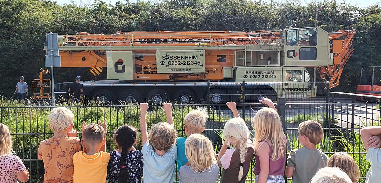
Vandaag was de Ambachtsweg ter hoogte van de Regenboog enkele uren afgesloten voor verkeer. Er stond namelijk een grote hijskraan naast de school om 260 zonnepanelen op het dak te hijsen. Vanuit de school en van achter de hekken konden de kinderen het indrukwekkende spektakel bekijken. Het zal ongeveer twee weken duren voordat alle panelen zijn gemonteerd en aangesloten. 

Van alle scholen van Stichting OBODB heeft de Regenboog het grootste dak. Dat maakt onze school bij uitstek geschikt voor zonnepanelen. Het aantal panelen is precies genoeg om ons energieverbruikt te compenseren. Hiermee zetten we een grote stap richting een duurzame toekomst en de moderne school die wij willen zijn. 

Archief